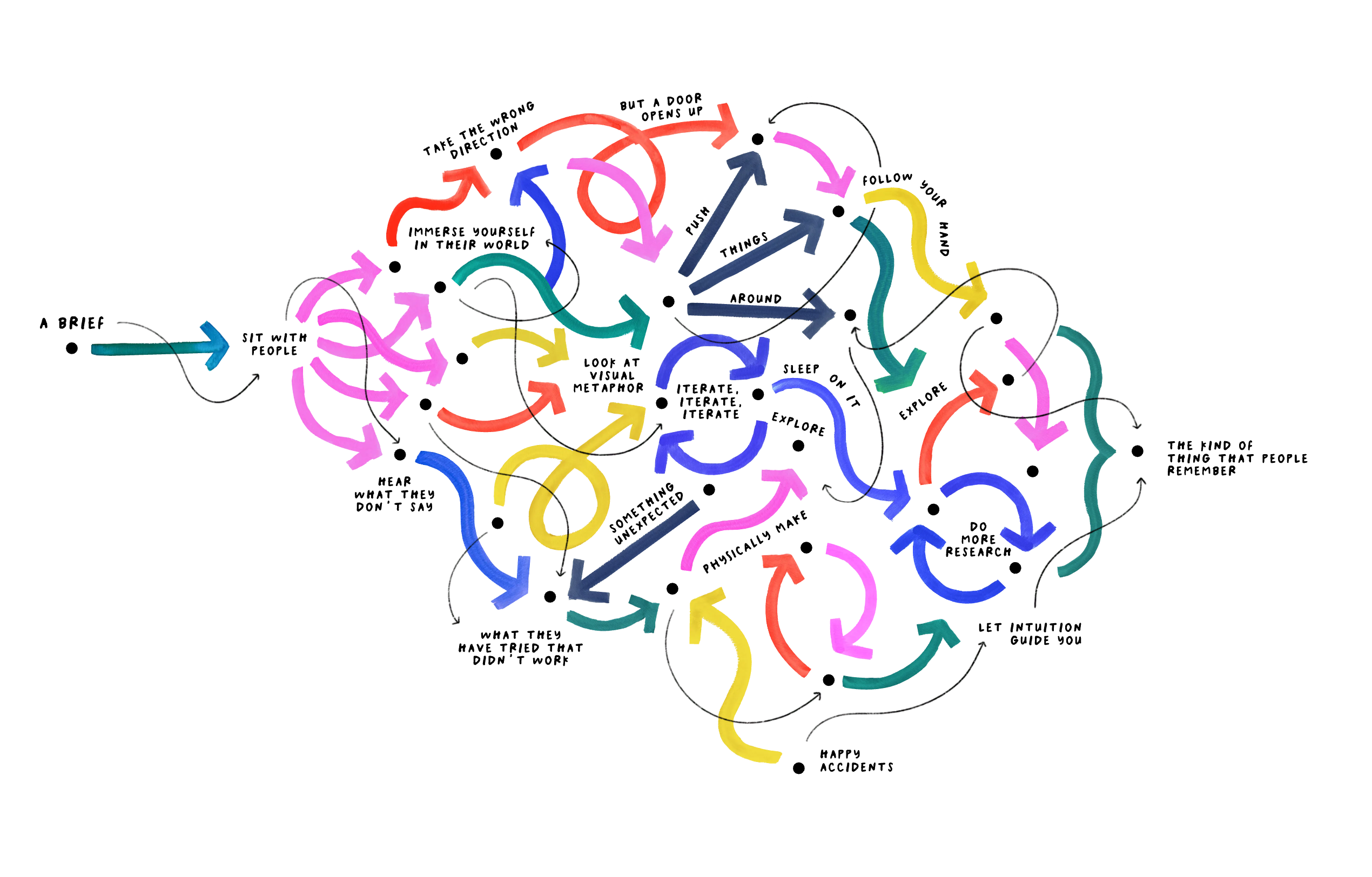
Giorgia Lupi su come usano e non usano l’AI (nel suo team). Nel lungo articolo si parla anche delle deviazioni, che spesso aiutano più delle scorciatoie.
Where we won’t use A.I. is during the discovery, listening and thinking phase. Crucial information surfaces in early conversations. We learn what people are afraid of, what they’ve tried that didn’t work and what they believe versus what they have learned to perform. A.I. can scan annual reports and map the competitive landscape, but the strategic picture that actually matters doesn’t live in documents.
Celine Nguyen sul gusto, che si definisce e viene fuori anche perdendo tempo.
Not only do people make do with less data, but they also draw from seemingly irrelevant, unimportant inputs. When I began working as a product designer, I still found myself scrolling through images of ‘90s avant-garde Belgian fashion, instead of more obviously useful content, like screenshots of B2B SaaS software. If this was developing my taste, then what was being developed, and how?
It also seems very distinctively human — to train yourself in ways that seem like a waste of time.
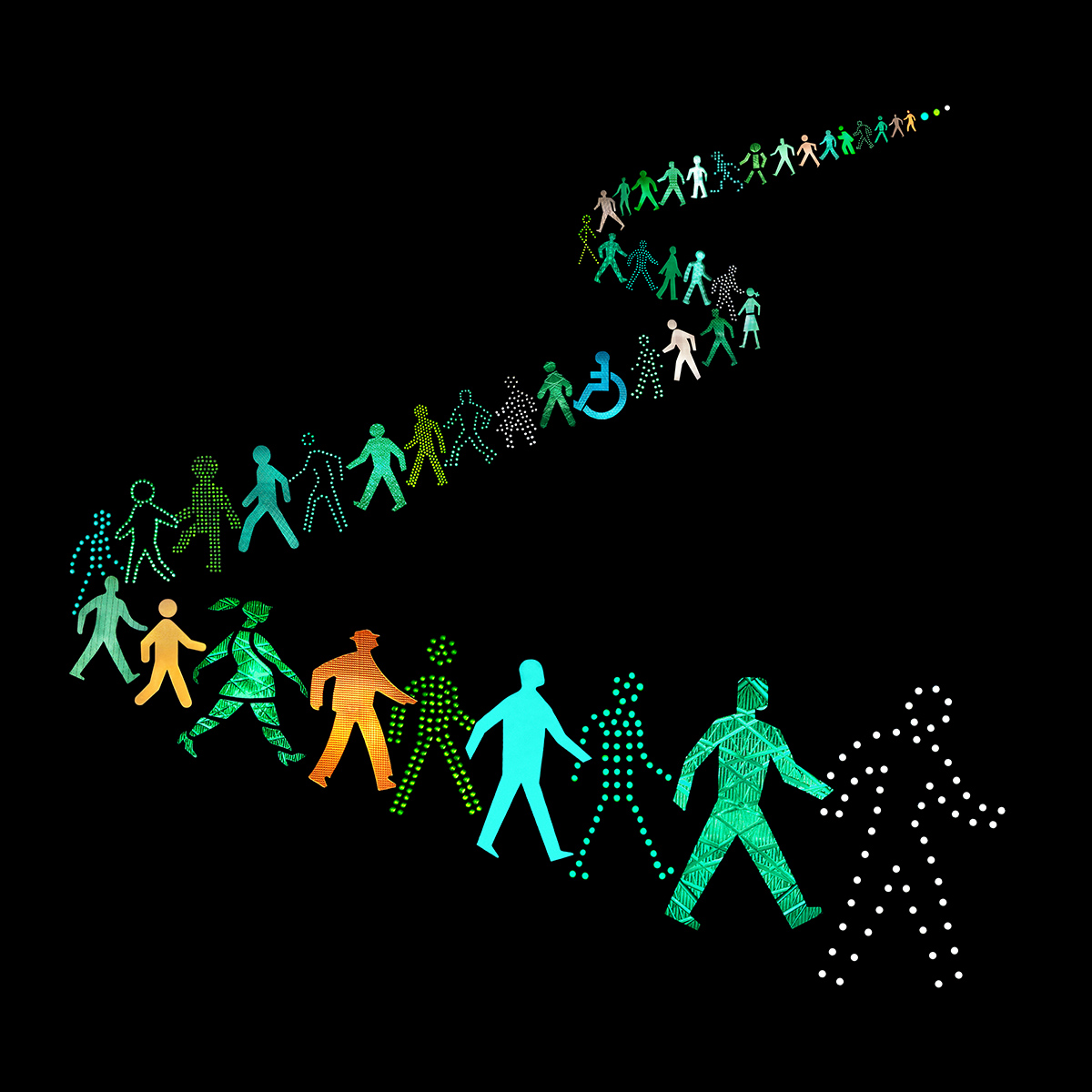
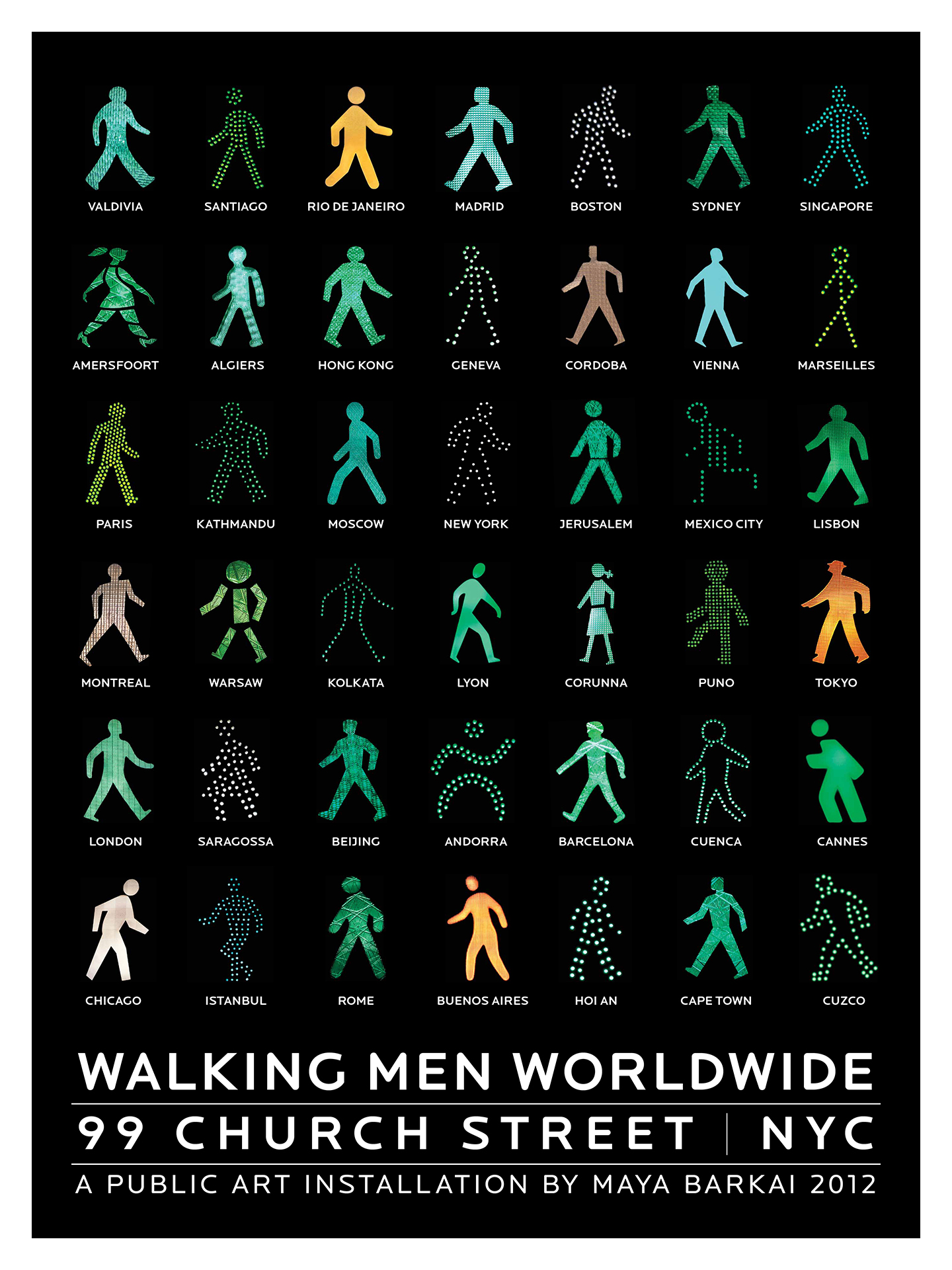
Walking Men Worldwide è un progetto dell’artista e fotografa Maya Barkai. Barkai, con l’aiuto di altri fotografi (amatori e professionisti) ha raccolto le figure dei semafori pedonali da varie città di tutto il mondo. La raccolta è diventata una serie di installazioni pubbliche e un archivio visivo delle diverse identità urbane.
Strumenti, piattaforme e riferimenti spingono verso le stesse soluzioni. Succede da tempo. Il design tende sempre più all’omologazione e la proliferazione di strumenti accessibili a tutti potrebbe allargare ulteriormente lo spazio occupato dal “medio”. (Questa cosa allo stesso tempo potrebbe essere un bene e un male).
New design tools and platforms that promise speed and ease keep arriving, and honestly, they’re good. New agents, new ways to create, faster every time. Motion, coding, typographic systems, the whole apparatus of what we do keeps getting more democratised. That’s worth celebrating.
But something else is happening alongside this. Design is flattening. Not getting worse, exactly, getting narrower. Less weird. Less range. Less of the thing that only one person, or one challenging brief, or one long night can make.
The democratisation of creativity hasn’t made originality easier. It’s made it rarer. The more the range of outputs shrinks, the wider the middle grows to hold them all. And as the middle grows, the distance to something more distinct grows with it.
A un certo punto un prodotto (un qualsiasi prodotto) viene sepolto dall'aggiunta di una marea di funzioni. Sembra inevitabile. (Un articolo di Geoff Teehan nel blog del team di design di Lightspark).
The first version of a product does one thing and usually does it pretty well. Then people use it, which is unfortunately where the trouble starts.
People want things. Teams get bigger. Customers ask for features. Competitors ship things. There are quarterly goals. Someone discovers a new market segment. Someone else has a partnership. Eventually someone says AI.
Most of these requests make sense on their own, which is exactly the problem. Nobody wakes up and says, “Let’s make this product substantially worse over the next five years.” It happens one perfectly reasonable decision at a time.
Un pezzo di codice CSS di vent’anni con molta probabilità funziona ancora oggi, ed è una cosa notevole.
And the real crazy part is that my bad decades-old code still renders fine in today’s latest web browsers! I would be sad if it didn’t, but I also wouldn’t be surprised. How is this stuff still backwards compatible!?
How much of your software from 20 years ago runs on your devices today? I realize CSS is actually “software”, but it is a kind of user interface for making stuff. Most things in tech get worse as time goes on, filled with upsells and ads, or sparkle icons to try out some rad new agent surreptitiously shoved into an app. CSS gets better with age and as more features are added. That’s bananas!
La necessità dell’attrito e del disaccordo per una buona progettazione.
Not in the Figma file. Not in the pull request. In the friction between two people who care about different things and are forced to find a shared answer.
Il design system al tempo dell’AI. Il vincolo funziona se si trova e si capisce. Vale per gli agenti, vale per le persone.
Design systems fail when people don’t use them, don’t trust them, or can’t find what they need. AI adds another version of that problem. If an agent can’t discover the right component or doesn’t have enough context to use it correctly, it may generate something new.
Quando una mappa diventa uno schema. Da un libro sulle mappe ferroviarie britanniche.
Well-designed diagrams will have a sense of aesthetic balance between lines and typography. Their overriding imperative is to inform the passenger of the connections between destinations at a glance, rather than a slavish requirement to follow the topography.
Da un estratto di un libro della Taschen sulle moderne identità visive.
Olivetti’s unique corporate identity did not come about through following norms but through an expansive understanding of design.
Despite there being a number of breakthrough examples, most early corporate identities in the first half of the 20th century were based on the creative signature of an individual designer who produced, for example, posters, brochures and packaging in the same style. An important impetus in design history thus emerged with the approach of the Italian typewriter manufacturer Olivetti. In the early 1930s, Adriano Olivetti (1901-1960), the son of the company founder, established the principle of working with not just the best engineers but also the most innovative architects and product and graphic designers in Europe.
We need to stop pretending that “the cloud” is a place. It’s not a place. It’s a promise—and promises are only as good as the entity making them. The web was supposed to be decentralized, resilient, a network of nodes that could route around damage. But in practice, we’ve spent the last decade centralizing our lives into a handful of walled gardens, each with its own exit strategy and its own definition of “forever.”
I have a colleague who has completely embraced A.I. My understanding is that his course is much harder than it used to be, but students are allowed to use A.I. during exams. I see the motivation—A.I. is supposed to enhance our skills/productivity, so students should be expected to produce more—but I don’t want to create a situation where students are helplessly dependent on A.I. because they don’t have a solid grasp of the fundamentals.
I’ll say that the computing speed of today’s devices is fast enough to trick some people into thinking that such devices are doing more than just performing calculations. But this ‘understanding’ and ‘learning’ and ‘communicating’ are just a faster and sometimes more efficient autocorrect. Yes, the autocorrect you have on your phones and tablets and personal computers.
When you’re typing a message and you see your phone’s OS correctly suggesting the next word after the one you’re typing, that’s not intelligence. The phone doesn’t ‘get’ you. The phone doesn’t ‘know’ you. The system is making a prediction by calculating probabilities. The data sample it’s using for this prediction is everything you’ve typed on the phone since you bought it.
È una questione di calcolo, di computazione:
By the way, Large Language Models don’t even see those as words, but numbers, tokens.
It wasn’t artificial intelligence, it was computers that computed. It’s always been computers computing. We have more refined tools today, but that’s it.
Con l’AI stiamo assistendo all’ennesimo giro dello stesso ciclo: accesso facile, poi un nuovo soffitto sopra chi sa usarlo davvero.
Design tools followed the same arc. Figma lowered the floor of UI design — suddenly, anyone could open a canvas and move elements around. Design systems lowered it again. Templates lowered it further. Each step made the starting point more accessible. And each step produced a new professional layer above it — people who understood not just where the buttons were, but what they were actually for.